
Starting prompts for Naming, Logo, Packagings & Website
Prompt for Naming
Act as a global brand naming expert specialized in premium organic beverage brands.
Generate 20 original brand name ideas for a 100% bio fruit drink company.
Brand personality:
– Fresh
– Clean
– Organic
– Modern
– Energetic but natural
– Suitable for international markets
Naming style requirements:
– One-word names only
– 5–8 letters max
– Easy to pronounce in multiple languages
– Smooth phonetics (vowels flowing naturally)
– Slight Latin / Mediterranean / Scandinavian vibe
– Should feel premium but friendly
– Avoid obvious words like “fruit”, “bio”, “juice”, “organic”
Structural preference:
– Names may subtly combine natural elements (sun, vitality, plant energy, freshness) without being literal
– Balanced consonant–vowel rhythm
– Visually strong for typography (good symmetry and clean letter shapes)
– Must look good in uppercase
Avoid:
– Complicated spelling
– Harsh aggressive energy drink tone
– Generic eco clichés
– Overly fantasy or sci-fi sounding names
Output:
Provide only the list of names, no explanations.
Prompt for LOGO
Create a clean, modern, SUPER FRESH & 100% BIO logo for a fruit drink brand named:
FRUVIA
STYLE / VIBE: Fresh, organic, premium, minimal. Must feel like cold-pressed juice / bio fruit drink. No childish vibes. No aggressive energy-drink vibes.
OUTPUT RULES (VERY IMPORTANT):
- Deliver ONLY the final logo (no mockups, no explanations).
- Black & white only (1 color). No gradients, no shadows, no 3D, no textures.
- Vector-style, crisp edges, high contrast, print-ready.
- Transparent background.
- Centered composition, perfectly balanced spacing.
- Provide 3 variations in ONE image: (1) icon only, (2) wordmark only, (3) icon + wordmark lockup.
LOGO CONCEPT:
- A minimal organic icon that subtly suggests fruit + nature + purity.
- Use ONE strong simple symbol: e.g., a fruit droplet, a leaf-integrated fruit seed, or a circular “sun/fruit” mark.
- The icon must be unique and not generic stock-leaf. Avoid cliché leaf-on-top-of-letter.
TYPOGRAPHY:
- Clean custom wordmark for “FRUVIA”.
- Use a modern geometric sans or soft humanist sans feel.
- Subtle organic touch allowed: slightly rounded corners, gentle terminals, but still premium.
- Letter spacing slightly open (not tight).
- Optional detail: turn the dot of the “I” into a tiny seed/drop shape (very subtle, not cartoon).
COMPOSITION:
- Icon should work as an app icon / bottle cap mark.
- Wordmark must be very readable at small sizes.
- Overall feel: Scandinavian clean meets organic vitality.
NEGATIVE CONSTRAINTS: No fruits illustrated in detail, no realistic fruit, no mascot, no watercolor, no handwritten script, no complex shapes, no retro badge, no circular stamp look, no “eco” clichés.
FORMAT: Crisp logo on a plain background, high resolution.
Prompt for Packagings
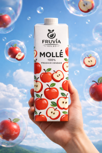
Create a clean, modern fruit nectar packaging design for a bio drink brand.
FORMAT: Front view, centered composition, studio lighting, ultra-realistic product mockup, 4K quality, vertical 9:16 ratio.
PACKAGING STYLE: – Minimal white base carton – Matte finish – Clean shadow on textured background – Modern organic aesthetic – Premium but friendly LOGO: Place attached logo at the top center of the package. Logo must be clean, high contrast, vector style. No extra effects.
FRUIT SYSTEM: Create a repeating illustrated pattern using APPLE. The fruit illustrations must: – Be flat, graphic, slightly playful but premium – Use bold simple shapes – Include both whole fruit and sliced cross-sections – Keep consistent scale and spacing – Avoid realistic photography style – Look like modern organic packaging illustration
TYPOGRAPHY STRUCTURE (CENTERED): Top: Brand logo Middle large text: MOLLË Below it (smaller text): 100% PRODHIM VENDOR Hierarchy must be clear. Bold modern sans-serif typography. Clean spacing. No clutter.
OVERALL MOOD: Fresh, organic, minimal, premium. No gradients. No busy background. No childish cartoon style. No energy drink vibes. Must feel like a healthy natural bio product line.
Prompt for Website
PROMPT:
Create a super fresh, organic, modern landing page design for a 100% bio fruit juice brand.
Brand Name: FRUVIA
Use the ATTACHED LOGO as the official brand logo (do not redesign it, keep it clean and centered in header).
Use the ATTACHED PACKAGING IMAGES as product visuals (apple, orange, cherry, peach variants).
STYLE DIRECTION:
Clean Scandinavian minimalism mixed with playful organic fruit energy.
Premium but friendly. Natural but modern.
No dark mode. Bright, airy, high-white layout.
COLOR SYSTEM:
Base background: warm off-white / soft cream (#F7F5F2 style tone).
Accent colors pulled from packaging fruits (apple red, orange orange, cherry red, peach orange).
Use subtle organic gradients inspired by real fruit tones (very soft, not aggressive).
Buttons in bold fruit color depending on section.
TYPOGRAPHY:
Modern geometric sans serif for headings (bold, confident).
Clean humanist sans for body text.
Large spacing, breathable layout, strong hierarchy.
LAYOUT STRUCTURE:
- HERO SECTIONFull-width minimal hero.Soft organic abstract fruit gradient background.Centered logo at top.Big bold headline: “100% BIO. 100% NATYRË.”Subtext about local production and freshness.
CTA button: “Shiko Shijet”
On the right side: 3D floating mockup of one packaging variant (use ATTACHED PACKAGING).
Add subtle floating fruit illustrations around product for depth.
- FLAVORS SECTIONGrid layout (4 columns desktop).Each flavor card:– Large product image– Flavor name (MOLLË / PORTOKALL / VISHNJE / PJESHKË)– Short one-line description
– Minimal fruit pattern background inspired by packaging.
Hover effect:
Card slightly lifts, fruit pattern softly animates.
- WHY FRUVIA SECTIONSplit layout.Left side: large clean product shot.Right side: 3 organic bullet points:– 100% Bio Ingredients– Prodhim Vendor
– Pa sheqer të shtuar
Use thin organic line icons.
- PROCESS SECTIONMinimal 3-step horizontal process:Pick → Press → PackUse soft organic shapes behind each icon.
- TESTIMONIAL SECTIONSoft beige background.Minimal cards.Round avatar placeholders.Short clean quotes.
- FINAL CTA SECTIONBig bold section with fruit-inspired gradient background.Centered headline:“Gati për freski natyrale?”CTA button:“Porosit Tani”
FOOTER:
Minimal.
Logo.
Quick links.
Social icons.
Soft divider lines.
DESIGN DETAILS:
– Use rounded corners (12–20px radius).
– Soft shadow, no harsh drop shadows.
– Subtle grain texture in background.
– Generous white space.
– Modern ecommerce ready feel.
IMAGE STYLE:
Use the attached packagings as hero product renders.
Keep proportions realistic.
High-end commercial lighting.
MOOD:
Fresh.
Organic.
Premium.
Simple.
Confident.
European eco-brand aesthetic.
Prompts for Social Media
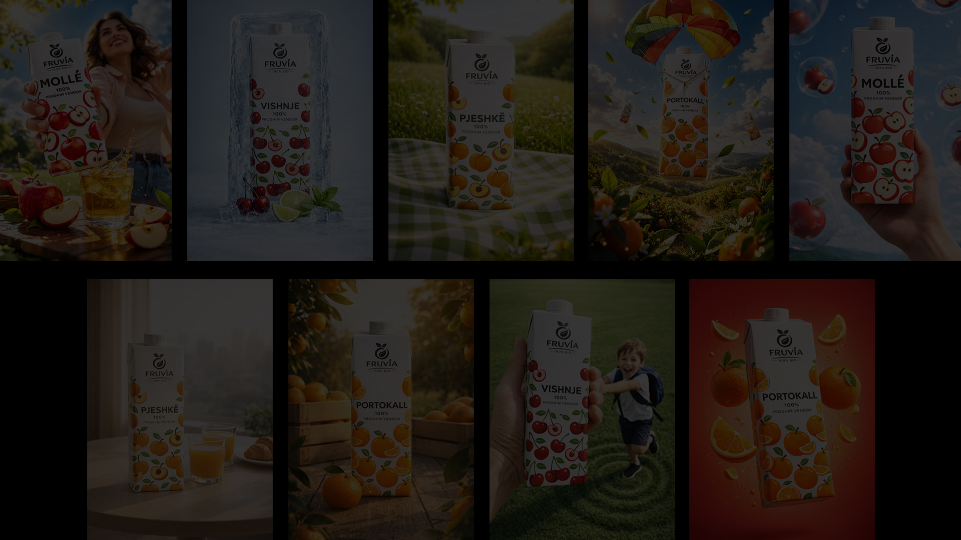
Social Media Post 01
Ultra-realistic commercial lifestyle product photography, vertical 9:16 format.
Use {ATTACHED_PRODUCT} as the exact product reference. Preserve the original packaging design, logo, typography, colors, proportions, cap/rim shape, and material exactly as shown in the attachment. Do not redesign or reinterpret the label. Do not modify branding. The product must remain identical to the uploaded reference.
Scene: outdoor park environment during bright daytime. Natural blue sky with soft white clouds in the background. Subtle green tree foliage visible on one side of the frame, slightly blurred.
Camera angle: dramatic low-angle hero perspective shot from below, wide lens look (24–28mm equivalent). The product is held in one hand very close to the camera, dominating the foreground (about 60% of the frame). The hand grip is natural and realistic with detailed skin texture, clean nails, natural lighting. No distorted fingers.
The person holding the drink stands behind it and is softly out of focus. They are smiling and looking slightly upward (not directly at the camera). Modern casual outfit with soft summer colors. The person is secondary; the product is the hero.
Lighting: natural sunlight with realistic highlights on the packaging. Soft shadow transitions. Professional advertising quality. Clean reflections consistent with outdoor lighting. Balanced exposure. No harsh HDR. No artificial studio look.
Depth of field: shallow focus on the product, smooth background blur. Realistic bokeh. Premium commercial retouching.
Color grading: fresh, vibrant but natural. Slight warmth. Clear sky blues and healthy greens. The product colors must remain accurate to the attachment.
Texture fidelity: sharp label details, readable typography exactly as on the attached product. No AI-generated fake text. No melting labels. No warped logos.
Overall mood: energetic, refreshing, modern fruit drink advertisement. Authentic lifestyle moment, not staged studio photography.
Negative constraints:
No brand alterations. No added text. No extra logos. No watermarks. No distorted hands. No extra objects in hand. No overexposed sky. No unrealistic shadows. No duplicate products. No redesign of packaging.
Ultra high resolution, professional commercial ad quality, realistic skin tones, clean composition, cinematic depth, natural outdoor environment, premium beverage advertising aesthetic.
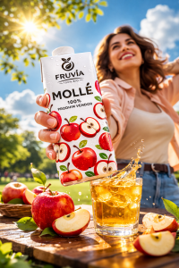
Social Media Post 02
Ultra-realistic high-end product advertising photo, vertical 9:16, clean studio setup, premium beverage hero shot.
MAIN SUBJECT (MUST MATCH UPLOADED PRODUCT):
Use the ATTACHED PRODUCT IMAGE: {ATTACHED_DRINK_PHOTO} as the exact product reference. Keep the same bottle/can shape, proportions, cap/pull-tab, material (aluminum/glass/plastic), and the label/artwork exactly as uploaded (do not redesign the label, do not invent new branding). Center the product in frame.
ICE BLOCK EFFECT (SIGNATURE LOOK):
The drink is trapped inside a thick, upright, translucent ice block like a frozen sculpture.
- Ice block is tall and vertical, roughly 1.6x the height of the drink, centered.
- Edges are organic and irregular, slightly wavy like melted-and-refrozen ice (not a perfect cube).
- Outer ice is clear, glassy, with subtle refraction and internal distortions.
- Around the drink, create a frosty/icy bloom (white frozen mist texture) so the product is visible but feels chilled and embedded.
- Add tiny bubbles, micro-cracks, frozen droplets, and realistic thickness.
- Condensation on the ice surface (small water beads), crisp highlights.
SCENE + COMPOSITION (MATCH THE REFERENCE VIBE, BUT ORIGINAL):
Minimal set, no text, no props clutter.
- Background: smooth cool blue gradient studio backdrop (soft sky-blue to slightly deeper blue), clean and modern.
- Ground: pale icy surface with fine frost powder, subtle sparkle, and a few water droplets.
- Composition: product and ice block dead center, symmetrical and poster-like, with negative space above.
- Camera: slight low-to-mid eye level, straight-on hero framing, mild depth-of-field (sharp on ice + product, softer background).
FRUITS / GARNISH SYSTEM (FLAVOR-AWARE, BUT ALWAYS KEEP CITRUS):
Create a fresh garnish arrangement at the base of the ice block:
- Always include lime/lemon elements in the shot: {CITRUS_TYPE = “lime” or “lemon”} with 2–3 wedges + 1 half slice, juicy and glossy. (Even if flavor is different, keep citrus present.)
- Add fruits that match the drink flavor: {FLAVOR_FRUITS} (examples: strawberry, raspberry, peach, mango, pineapple, watermelon, blueberry, cherry). Use whole + sliced pieces for realism.
- Add fresh mint sprigs (2–4) near the citrus for freshness cues.
- Add 2–5 small ice cubes scattered near the fruit (clear cubes with sharp edges, slight melt).
- Keep everything tidy, premium, not messy: fruits arranged naturally, not perfectly symmetrical.
LIGHTING (CRISP COMMERCIAL):
Studio lighting with a cold, refreshing mood:
- Large soft key light from upper left, gentle fill from right, subtle rim light to outline the ice.
- Strong specular highlights on ice edges, clean shadows under fruit.
- No harsh reflections that obscure the label; label remains readable but not overly sharp.
QUALITY / REALISM / RULES:
Photorealistic, 8K detail, professional product retouching, micro-texture visible (ice pores, condensation, fruit pulp).
No extra text, no watermark, no extra logos, no fake brand design.
Do not change the uploaded product label.
Keep it feeling like an original ad photo inspired by a “frozen-in-ice” concept, not a copy of any exact existing artwork.
PLACEHOLDERS (FILL THESE):
- {ATTACHED_DRINK_PHOTO} = user uploaded drink image
- {FLAVOR_FRUITS} = fruits matching the drink flavor (2–4 types max)
- {CITRUS_TYPE} = lime or lemon (always included)
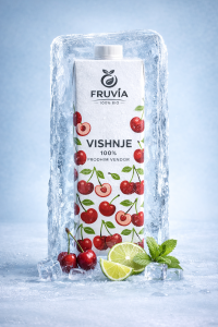
Social Media Post 03
Ultra-realistic premium outdoor beverage advertising photo, vertical 9:16, 8K detail, natural editorial look, high-end commercial retouch, clean composition, soft cinematic depth of field, subtle film grain.
PRODUCT (ONLY VARIABLE): Use [ATTACHED_DRINK_IMAGE] as the hero product. Keep the exact product shape, cap, label, colors, brand text, and any packaging details exactly as in the attached drink (do not redesign the label). Re-render it as a pristine, perfectly lit product packshot with realistic materials and crisp edges, no warping, no extra logos added.
SCENE / SETTING: Bright spring/summer meadow picnic scene on a gentle green hill. Foreground: a green-and-white checkered picnic blanket (gingham) covering the lower part of the frame, soft fabric folds, realistic weave texture. Midground: the product standing upright and centered on the blanket. Background: lush grassy field with tiny wildflowers, soft rolling hill, and a blue sky with soft white clouds. Frame the top edges with out-of-focus leafy tree branches creating a natural vignette/bokeh canopy.
LIGHTING: Warm natural sunlight from upper right, soft glow + gentle rim light on the product edges, realistic reflections matching the product material (carton/plastic/glass/can). Add a subtle, tasteful lens flare / sun haze near the top-right sky area. No harsh shadows—soft, believable midday outdoor shadows.
CAMERA / COMPOSITION: Low-angle product hero shot (slightly below mid-height), centered composition, product takes ~55–65% of the frame height. Shallow depth of field: product sharp, background smoothly blurred (bokeh leaves and distant field). Realistic perspective and scale. Clean color grading: fresh greens, airy highlights, slightly punchy but natural saturation.
DETAILS: Micro-contrast on the product, crisp print legibility on the label (as in attachment), tiny dew/freshness feel is okay but subtle (no fake water splashes). Blanket pattern should be clean and aligned, not distorted. No random extra fruits unless they exist on the attached product itself.
OUTPUT RULES: No text overlays, no slogans, no badges, no watermark, no frame, no QR code added. Avoid copying any recognizable brand layout from references—only replicate the vibe: premium picnic meadow product hero ad.
NEGATIVE (must avoid): cartoon/illustration, CGI/plastic look, over-sharpening halos, messy artifacts, duplicate products, extra labels, changed branding, incorrect language text, weird hands/people, unrealistic floating, bent packaging, warped typography, excessive glare, heavy vignette, oversaturated neon greens.
Social Media Post 04
Ultra-realistic premium lifestyle advertising image, vertical 9:16, high-end commercial CGI + photo composite look, crisp details, soft cinematic depth of field, natural daylight, subtle film grain, clean color grading, no text overlays.
HERO PRODUCT (ONLY VARIABLE / MUST MATCH UPLOADED PRODUCT):
Use {ATTACHED_DRINK_IMAGE} as the exact hero product reference. Preserve the original packaging design, logo, typography, colors, cap/top shape, proportions, and material exactly as uploaded. Do not redesign the label. Do not invent new branding. Keep edges sharp, print details readable, realistic reflections, no warping.
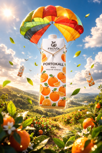
SCENE CONCEPT (FLOATING “DELIVERY BY CANOPY”):
The hero product is floating mid-air, suspended beneath a bright multicolor fabric canopy (parachute / umbrella-kite hybrid). The canopy is made of bold curved segments (multiple saturated colors), slightly translucent fabric with realistic weave, gentle tension wrinkles, and thin suspension lines converging down to a small harness around the product. The canopy sits in the upper third of the frame; the product hangs centered below it, slightly forward toward camera (hero placement).
ENVIRONMENT (FRESH SPRING LANDSCAPE):
Background: wide open green rolling hills under a vivid blue sky with soft puffy clouds. Foreground: a dense field of low plants and fresh blossoms (small orange/red flowers mixed with rich green leaves), creating a textured carpet that fills the bottom third of the frame. Distant tree line/hills softly blurred.
ATMOSPHERE + MOTION:
Dozens of fresh green leaves swirling through the air at different depths (some close to lens with motion blur, some midground sharp, some far away tiny). Leaves should feel wind-carried and weightless. Add a gentle sense of upward lift and airy freshness.
SECONDARY PRODUCTS (SAME PRODUCT, SMALLER, NOT REDESIGNED):
Place 3–6 small duplicates of the same {ATTACHED_DRINK_IMAGE} floating farther in the background at varying sizes and distances (like they’re drifting in the wind). Keep them subtly out of focus, slightly angled, but still clearly the same product design. No extra packaging types, no new labels.
LIGHTING:
Bright natural midday sun with soft shadows. Clean highlights on the product, realistic reflections on packaging, balanced exposure (no blown highlights), vibrant but not oversaturated.
CAMERA / COMPOSITION:
Slight low-angle hero perspective, 35–50mm look. Product centered, canopy above it, horizon line low, strong depth layering (foreground leaves + flower field → hero product → background hills and clouds). Premium ad framing, uncluttered, cinematic DOF.
QUALITY RULES:
Photoreal materials, crisp print detail, no artifacts, no extra text, no watermark, no brand substitutions, no distorted hands, no weird strings.
NEGATIVE PROMPT:
cartoon, illustration, anime, flat graphic style, low-res, blurry hero product, unreadable label, wrong logo, changed typography, extra logos, extra text, watermark, messy composition, plastic-looking leaves, unrealistic physics, duplicated canopy shapes overlapping, warped package edges, AI glitches.
Social Media Post 05
Ultra-realistic premium beverage advertising image, vertical 9:16, high-end commercial retouch, crisp details, clean composition, subtle cinematic depth of field, soft natural light, gentle bloom, light film grain, no watermark.
HERO PRODUCT (ONLY VARIABLE):
Use {ATTACHED_DRINK_IMAGE} as the exact hero product reference. Preserve the original product shape, proportions, cap/pull-tab, material (glass/plastic/aluminum), label artwork, logo, typography, colors, and all brand details exactly as uploaded (do not redesign the label, do not invent new branding, no extra text). Render it as a pristine, perfectly lit packshot with sharp edges, realistic reflections, zero warping.
COMPOSITION / CAMERA:
Center the product vertically in the frame, hero scale (about 55–65% of frame height). Shot from slightly low angle (hero perspective), natural wide/standard lens look (24–35mm equivalent).
A realistic human hand enters from the bottom center, holding the product upright (clean nails, natural skin texture, correct finger anatomy, no weird fingers). The product remains the sharpest subject.
SCENE / BACKGROUND (OUTDOOR “FRESH SKY” LOOK):
Bright, clean cyan-to-sky-blue gradient background with soft daylight haze. Puffy white clouds scattered mid and lower background. Far distance: soft, atmospheric green hills/mountains along the bottom horizon line, slightly blurred by depth of field, calm summer mood.
SIGNATURE EFFECT: FLOATING FRUIT BUBBLES (MATCH FLAVOR):
Surround the hero product with multiple transparent soap-bubbles (8–12 bubbles total) floating at different depths and sizes.
Each bubble contains photorealistic fruit that matches the flavor of the attached drink: {FLAVOR_FRUITS} (use whole fruits and slices/cross-sections).
Bubble physics: realistic refraction, thin iridescent edge highlight, subtle rainbow sheen, soft internal distortion magnifying the fruit, tiny specular highlights, slight motion blur on a couple of background bubbles only.
Depth layout (important):
- 1–2 large out-of-focus bubbles partially cropped in the corners/edges (foreground framing).
- Several medium bubbles around the product (midground).
- A few small bubbles far back (background), softer focus.
LIGHTING:
Natural bright daytime sun feel, soft shadows, clean highlights on the product and bubbles. No harsh studio look. The product has a premium “advertising” polish while still feeling outdoors.
COLOR & MOOD:
Fresh, juicy, airy. Saturated but not neon. Strong contrast between blue sky and colorful fruit. Keep it modern and clean, not retro, not gritty.
STRICT NEGATIVES (MUST FOLLOW):
No added logos, no extra brand text, no slogans, no watermark, no packaging redesign, no extra hands, no deformed fingers, no cartoon style, no illustrated fruit, no messy clutter, no indoor studio background, no dramatic night lighting.
OUTPUT:
Ultra-realistic commercial photo, 9:16 vertical, high resolution, sharp hero product, realistic bubbles with fruit matched to {FLAVOR_FRUITS}.
Social Media Post 06
Ultra-realistic premium lifestyle beverage advertising photo, vertical 9:16, high-end commercial campaign look, natural editorial realism, soft cinematic depth of field, subtle film grain, professional retouch, clean minimal composition.
HERO PRODUCT (ONLY VARIABLE):
Use {ATTACHED_DRINK_IMAGE} as the exact hero product reference. Preserve the original packaging design, logo, typography, proportions, cap/straw/opening, material, colors and label exactly as uploaded. Do NOT redesign, reinterpret, or modify branding. Re-render as a pristine, perfectly lit product packshot with crisp edges and realistic materials. No warping, no extra logos.
SCENE / ENVIRONMENT:
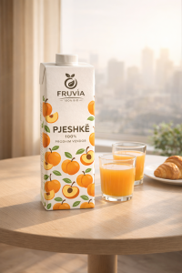
Cozy modern apartment breakfast corner during golden morning light. Large window in background with soft beige curtain on one side. Outside: modern city skyline slightly hazy in warm sunlight. Subtle atmospheric perspective. Calm, premium morning mood.
TABLE SETUP:
Small round light-wood table centered in lower half of frame.
On right side of table: white ceramic plate with a buttery croissant.
Near center-right: two small clear glasses filled with fresh juice (matching color tone of the drink). Realistic liquid refraction and transparency.
Hero product positioned left-center on table, slightly forward, dominant in frame. Natural grounded shadow under product.
LIGHTING:
Warm morning sunlight entering from window side. Soft diagonal sun rays with very subtle volumetric light particles. Gentle highlights on product edges. Balanced exposure. No harsh flash. Natural soft shadows.
CAMERA:
Eye-level slightly above table height. 28–35mm lens equivalent. Product in sharp focus. Background skyline softly blurred. Realistic depth separation. No distortion.
MOOD / COLOR:
Warm neutrals (beige, soft brown, natural wood). Fresh drink color stands out naturally. Premium, clean, minimal lifestyle advertising aesthetic.
STRICT RULES:
No text anywhere.
No typography.
No badges.
No overlays.
No watermarks.
No people.
No hands.
No extra props.
No brand modifications.
No surreal elements.
NEGATIVE PROMPT:
cartoon, illustration, CGI look, low resolution, blurry label, distorted packaging, extra logos, duplicate product, cluttered table, harsh flash lighting, oversaturated colors, dramatic shadows, extreme bokeh, artificial plastic look.
Social Media Post 07
Ultra-realistic premium fruit-drink advertising photo, vertical 9:16, 8K detail, natural editorial commercial retouch, crisp materials, clean composition, soft cinematic depth of field, subtle film grain.
PRODUCT (ONLY VARIABLE — MUST MATCH UPLOADED DRINK):
Use {ATTACHED_DRINK_IMAGE} as the hero product reference. Keep the exact bottle/can shape, proportions, cap/pull-tab, label artwork, typography, brand text, colors, and all packaging details identical to the uploaded drink. Do not redesign the label. Do not add new logos. Do not invent text. Re-render as a pristine, perfectly lit product packshot with sharp edges and accurate reflections, no warping.
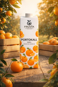
SCENE / SET DESIGN (CITRUS ORCHARD HERO SET):
Outdoor citrus orchard setting during warm golden hour. The product stands upright centered on a rustic wooden table made of wide planks with visible grain, small imperfections, and soft wear. Behind the product: two simple wooden produce crates/boxes (unfinished light wood), slightly offset left and right, creating depth but staying secondary.
Foreground detail: one whole citrus fruit (orange/tangerine) placed on the table near the base of the product, slightly off-center for balance. Optional tiny leaf attached to the fruit.
FRAMING ELEMENTS (SIGNATURE LOOK):
Create a natural “leafy frame” around the product using citrus tree branches:
- Left and right edges of the frame have close branches with glossy dark green leaves and multiple ripe oranges.
- Some oranges are partially cropped by the frame edges for a cinematic, immersive feel.
- A few leaves overlap slightly into the foreground, but do not block the product label.
BACKGROUND / DEPTH:
Background is a softly blurred orchard with sunlit greenery and distant trees, smooth bokeh highlights, no buildings, no people, no signage. Strong depth separation: product and table in sharp focus, orchard background creamy and defocused.
LIGHTING (WARM “SUN KISSED” AD LOOK):
Back/side golden sunlight coming from upper left, creating a soft sun flare and warm rim light on leaves and the bottle/can edges. Balanced fill light so the label is readable and not blown out. Natural shadows on the table, soft and realistic. Slight atmospheric glow in the distance.
CAMERA / LENS FEEL:
Eye-level product hero framing, slight low angle (subtle, not extreme). 50–85mm commercial product lens look. Centered hero composition, premium spacing, no clutter.
REALISM DETAILS:
Accurate glass/plastic/aluminum material response matching the uploaded drink. Subtle condensation droplets on the bottle/can (light, premium, not messy). Micro reflections on cap and label. No distortion, no extra props.
NEGATIVE PROMPT (IMPORTANT):
No new branding, no changed label, no fake text, no watermark, no QR codes, no hands, no people, no extra products, no busy props, no messy condensation, no cartoon look, no illustration style, no over-saturation, no harsh HDR, no blown highlights, no dark underexposure, no tilted horizon, no cut-off product, no duplicate bottles.
Social Media Post 08
Ultra-realistic high-end commercial key visual, vertical 9:16 (1080×1920), crisp advertising photography + subtle CGI compositing, bright daytime, vibrant but natural colors, clean retouch, sharp subject separation, soft cinematic depth of field, no text overlays, no watermark.
HERO PRODUCT (ONLY VARIABLE): Use {ATTACHED_DRINK_IMAGE} as the exact hero product reference. Preserve the original packaging/bottle/can shape, cap/pull-tab, label artwork, typography, logo, colors, and proportions exactly as in the attached image (do NOT redesign the label, do NOT invent new branding, do NOT add extra logos). Re-render it as a pristine, perfectly lit product packshot with realistic materials and crisp edges, no warping.
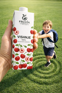
CORE CONCEPT / COMPOSITION (must match this idea, not any specific brand): A playful “larger-than-life” perspective scene: a giant human hand holds the hero drink close to camera on the left side of the frame, tilted slightly toward the viewer (dynamic angle, 10–20° tilt). A happy school-age child is on the right side, appearing to cling to or be pulled by the product/hand in a fun, exaggerated motion (as if the product is helping them move forward). The child is secondary to the product: product dominates ~60% of frame, child ~30%, background ~10%.
SCENE / BACKGROUND: A lush, well-manicured green grass field fills the entire background (no buildings, no roads). Add subtle “energy / ripple” rings in the grass behind the product/hand (concentric circular waves pressed into the grass texture), soft and believable, not neon, like a gentle pattern in the lawn. Bright clear sky lighting implied (no visible sky needed), fresh outdoor feel.
SUBJECT DETAILS:
- Hand: realistic adult hand in foreground, clean nails, natural skin texture, believable grip around the product, correct finger anatomy (no extra fingers), slight motion tension in the grip.
- Child: cheerful expression, mouth open laughing/smiling, looking generally toward camera area but not forced. Outfit should read “school vibe” without copying uniforms: simple white top + dark shorts/skirt + small backpack OR any school-accessory vibe. Keep it generic and original (no exact uniform replicas). Natural body proportions, no uncanny limbs, dynamic pose with one foot lifted as if mid-step.
LIGHTING: Bright midday sunlight, soft shadows on grass, high clarity. Product gets premium key light + gentle rim light to separate from background. Realistic reflections according to material (aluminum/glass/plastic/carton). Mild specular highlights on edges, no harsh overblown glare.
CAMERA / LENS LOOK: Wide lens perspective (24–28mm equivalent) to exaggerate the scale difference (product/hand huge, child slightly smaller behind). Camera positioned slightly above grass but low enough to feel epic. Focus prioritizes product label sharpness; child slightly softer but still detailed. Subtle motion energy via pose, not blur.
COLOR / MOOD: Fresh, optimistic, family-friendly, modern advertising vibe. Grass rich green, skin tones natural. Avoid overly saturated cartoon look. Keep it photoreal.
QUALITY CONTROL (strict negatives): No added headline text, no extra brand marks, no watermarks, no fake typography, no duplicated hands, no deformed fingers, no melted faces, no weird shoes, no distorted backpack straps, no background objects, no extra products. Keep the attached product label perfectly legible and unchanged.
FINAL FRAME RULES: Vertical 9:16, product on left foreground, child on right midground, ripple rings behind, clean negative space in upper area for future real ad copy (but DO NOT place any text now).
Social Media Post 09
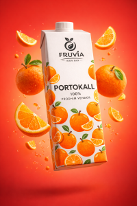
Ultra-realistic premium beverage advertising key visual, vertical 9:16, 8K detail, sharp commercial retouch, crisp cutout edges, clean studio lighting, high saturation but controlled highlights, subtle film grain, modern playful energy.
HERO PRODUCT (ONLY VARIABLE):
Use {ATTACHED_DRINK_IMAGE} as the hero product. Preserve the exact bottle/can shape, cap/tab, proportions, materials, label artwork, typography, brand text, and colors exactly as uploaded. Do not redesign the label. No added logos. No extra text.
COMPOSITION / CAMERA:
Single hero product only (no duplicates). The product floats mid-air, slightly angled for dynamism (~15–25° tilt), placed slightly off-center to create tension (not perfectly centered). Mild wide-lens commercial look (approx. 28–35mm). Product occupies ~55–65% of the frame height. Strong depth separation: product tack sharp, background smooth.
BACKGROUND (SIGNATURE LOOK):
Bold smooth studio gradient background: warm coral → red/orange with gentle vignette and soft falloff, no patterns, no scenery, no horizon line. Clean editorial backdrop.
FLAVOR FRUITS (MATCH THE DRINK):
Surround the product with floating, freshly cut fruits that match the flavor of the attached drink:
- Use {FLAVOR_FRUITS_LIST} (e.g., “strawberries + raspberries”, “pineapple + lime”, “orange + passionfruit”, etc.).
- Include 3–6 fruit elements total, mixed sizes.
- Use a mix of whole berries/small pieces and large juicy slices/wedges (at least one “hero slice”).
- Add tiny accent pieces (e.g., berries, seeds, or small chunks) for motion and depth.
- Fruits should look freshly cut with visible juice texture, realistic pulp, and crisp rind/skin detail.
- Place fruits at different depths: some near the lens (slight blur), some midground near product, some further back.
DYNAMISM / FLOATING FEEL:
Everything appears suspended mid-air with natural motion: slight rotation variation on fruit pieces, realistic perspective, no gravity errors. Add minimal motion blur only on the closest tiny fruit accents (very subtle).
LIGHTING:
High-end studio setup: soft key light from upper left, gentle fill, faint rim highlight on product edges to separate from background. Realistic reflections on bottle/can, clean speculars, no blown-out whites. Fruits have glossy moist highlights.
SHADOWS / REALISM:
No ground plane. Add subtle contact shadows and soft ambient occlusion where fruits overlap or come close to the product. Keep it clean and premium.
COLOR / STYLE RULES:
Vibrant, juicy, modern. No retro typography overlays. No graphic stickers. No illustrated elements. No extra packaging props. No hands. No condensation unless it already exists on the uploaded product.
NEGATIVE PROMPT (STRICT):
No text overlays, no slogans, no watermarks, no extra logos, no duplicated products, no background objects, no table/blanket, no scenery, no humans, no cartoon/illustration, no AI artifacts, no warped label, no misspelled brand, no deformed fruit, no muddy colors, no harsh clipping halos.