
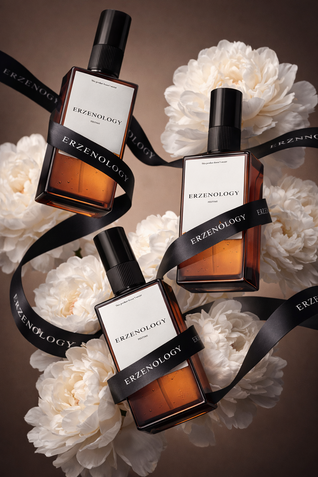
The product is attached. Use the product exactly as provided. Do not modify its shape, proportions, label design, typography, logo placement, or packaging structure. Preserve the original branding precisely. Create a dynamic levitating composition where the product floats in mid-air. If multiple units are provided, arrange them in a visually balanced but dynamic layout with subtle tilt, allowing the underside or base of the product to be slightly visible for depth and realism. Wrap the product elegantly with a wide black satin ribbon that flows naturally through the composition. The ribbon must feature a repeated white logo (use the brand visible on the attached product). The ribbon should look luxurious, slightly glossy, with soft highlights and natural folds. Important: the ribbon must not cover or obscure the main product name or essential label information. Place lush, voluminous white peony flowers between and around the product. The flowers should look fresh, soft, and sculptural, adding contrast between organic texture and modern packaging. Petals must have subtle translucency and natural shadowing. Arrange them in a balanced but organic way, enhancing the premium feel without overcrowding the composition. Camera angle: slightly low-angle perspective. The product should be gently tilted to create depth and a premium editorial feel. The framing must leave clean negative space around the composition; the product must not touch the frame edges. Background: monochrome studio background in a soft milk-chocolate tone (warm muted brown). Smooth gradient or subtle studio falloff, no texture unless specified. Clean, minimal, elegant. Lighting: soft studio lighting with diffused key light. Emphasize volume and curvature of the product. Gentle highlights on edges. Subtle shadow gradients for depth. No harsh reflections unless appropriate for material. High-end commercial beauty lighting setup. Mood and style: clean, elegant, luxurious, minimal, editorial beauty campaign aesthetic. Focus on material realism, accurate shadows, fine details, natural depth of field, and premium composition. Ultra sharp focus on the product branding. Slight depth of field for background separation. No distortion. No over-saturation. Balanced color grading. If you use this with other products, just swap the brand name reference inside the ribbon instruction and keep the structural logic intact. The power here is the system: levitation + ribbon flow + organic florals + minimal chocolate backdrop + soft luxury lighting. That combination creates instant premium perception because it plays with contrast: matte vs satin, organic vs industrial, stillness vs motion. Design is rarely about adding more. It’s about creating tension between elements that don’t naturally belong together and making them look inevitable.